 Image 1 of 3
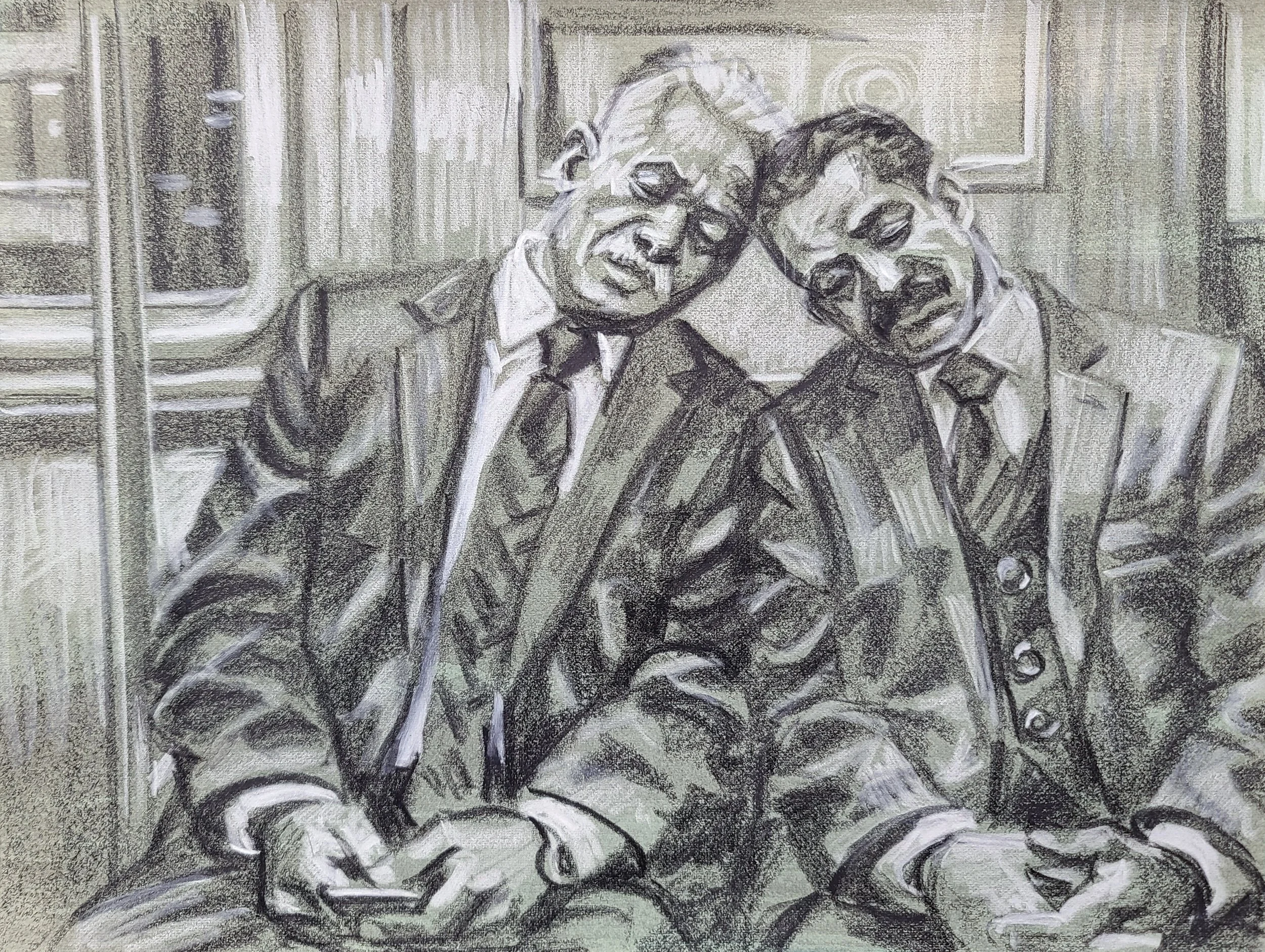 Image 2 of 3
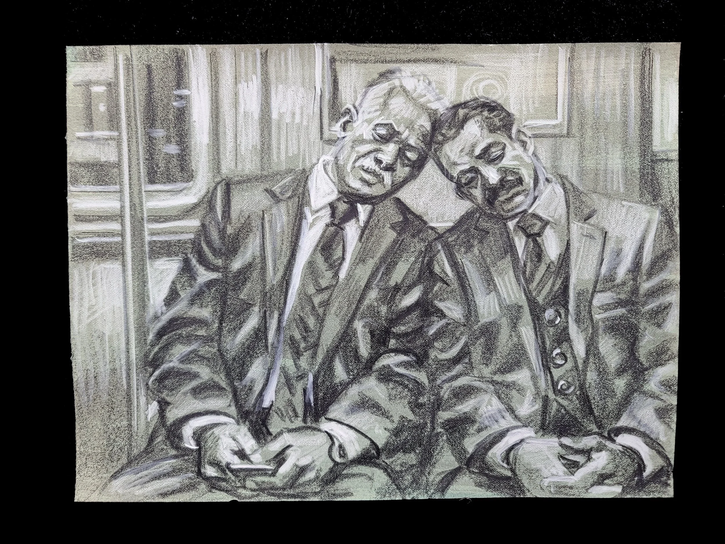 Image 3 of 3
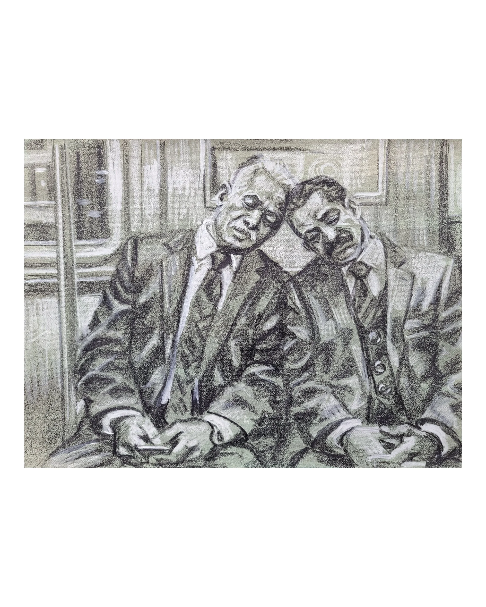
“Companions on the Subway” 9 × 12 inches, Crayon on toned Rives BFK
This is a handmade, original work of art NOT A PRINT and NOT AI GENERATED
FREE SHIPPING Shipping takes 3–4 Weeks This ships from San Carlos, California (The San Francisco Bay Area). I use UPS and sometimes US Post.
I have a whole collection of paintings of sleeping people on the subway in my imagination. I’ve been piecing together images of subway interiors and people sleeping, making sketches and more finished drawings as I work out the ideas. This is one of my earliest attempts at bringing the subject into a somewhat finished drawing. I suppose it’s one part a study and several parts a finished work.
The two men sit close together, their heads resting against one another. Their tilted heads and sloping shoulders contrast with the upright poles and rectangular windows of the subway car. Dark jackets, pale shirt collars and the folds of their clothing give the bodies weight. The white marks pick out the faces and hands, while the darker passages connect the figures to the surrounding interior.
At 9 × 12 inches, this is a small drawing that establishes some of the poses I want to explore. I rather like this interior as a backdrop and plan to reuse it in several paintings and drawings. I’ve also envisioned versions with different ages, races, same-sex and heterosexual couples in the same clothes and sleeping poses. These are ideas I’m still developing through the drawings.
I’m using one of my favorite techniques because it comes so close to painting. I tone Rives BFK paper with a wash, then draw back over it with black and white crayons. The wash supplies a middle tone. I can work darker or lighter from that starting point, building the forms while allowing the paper’s texture to show through.
The relationship between those tones reminds me of what my printmaking teachers called a “chiaroscuro woodcut.” This is a drawing, not a woodcut or a print, but it shares that interplay of light, dark and a middle tone. It’s also a nod to the Baroque tradition of heightening a drawing with white over black or brown on paper.
Part of this process is figuring out which marks and textures I might carry into a painting. A broad patch of shadow, a sharp contour or a quick white stroke can do quite different things. This drawing gives me a chance to work those things out while also making something I enjoy as a finished work.
Art-history reference checked: The Met on chiaroscuro woodcuts and toned-paper drawings.


